Yvonne Typeface
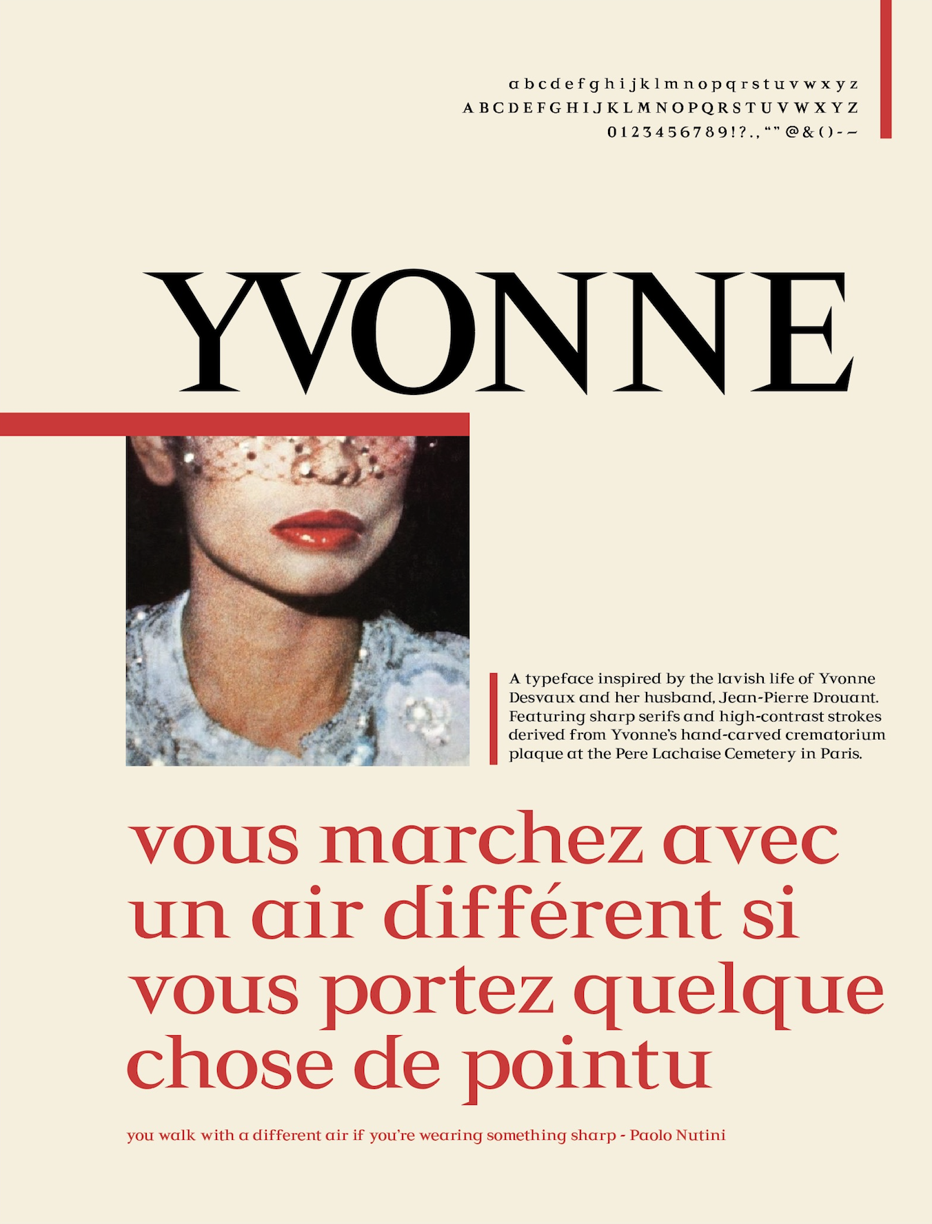
Yvonne is a wedge serif typeface created by me and a group of my colleagues, inspired by the crematorium plaque of Yvonne Desvaux found at the Pere Lachaise Cemetery in Paris, France.
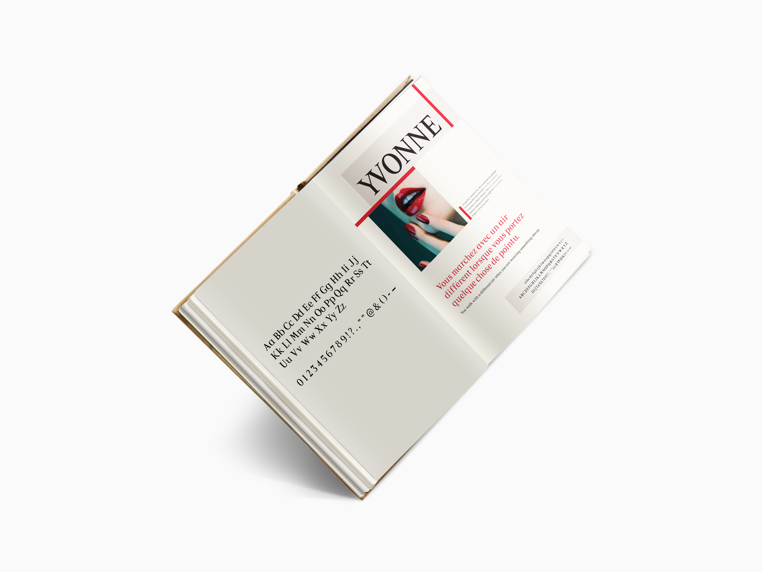
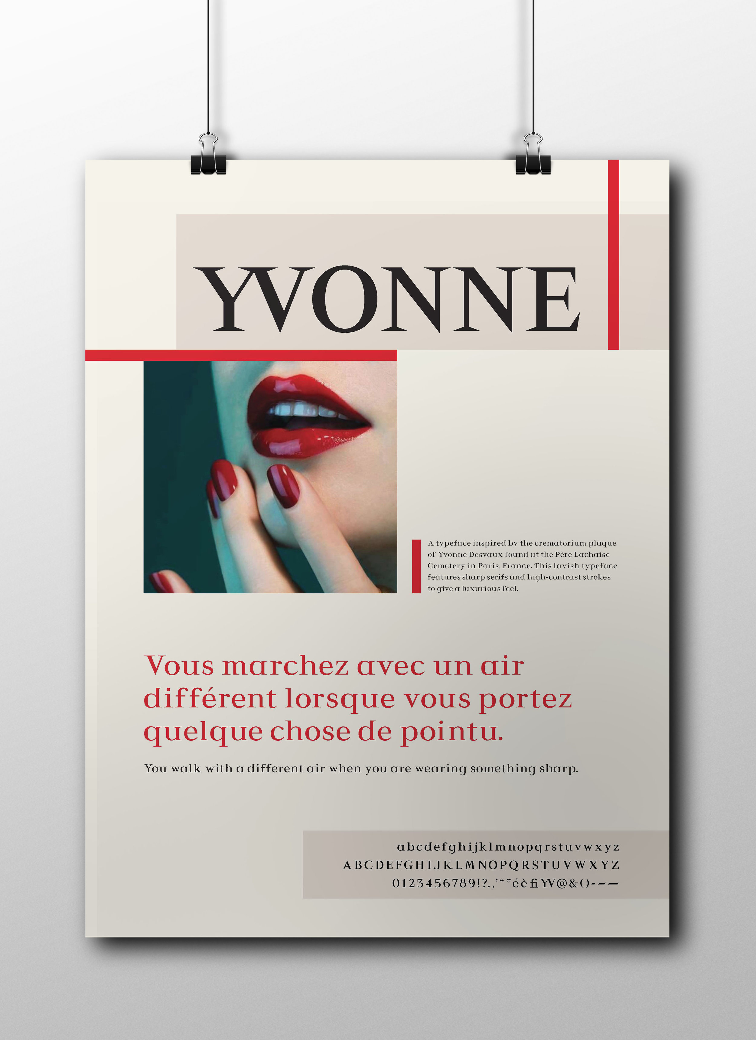
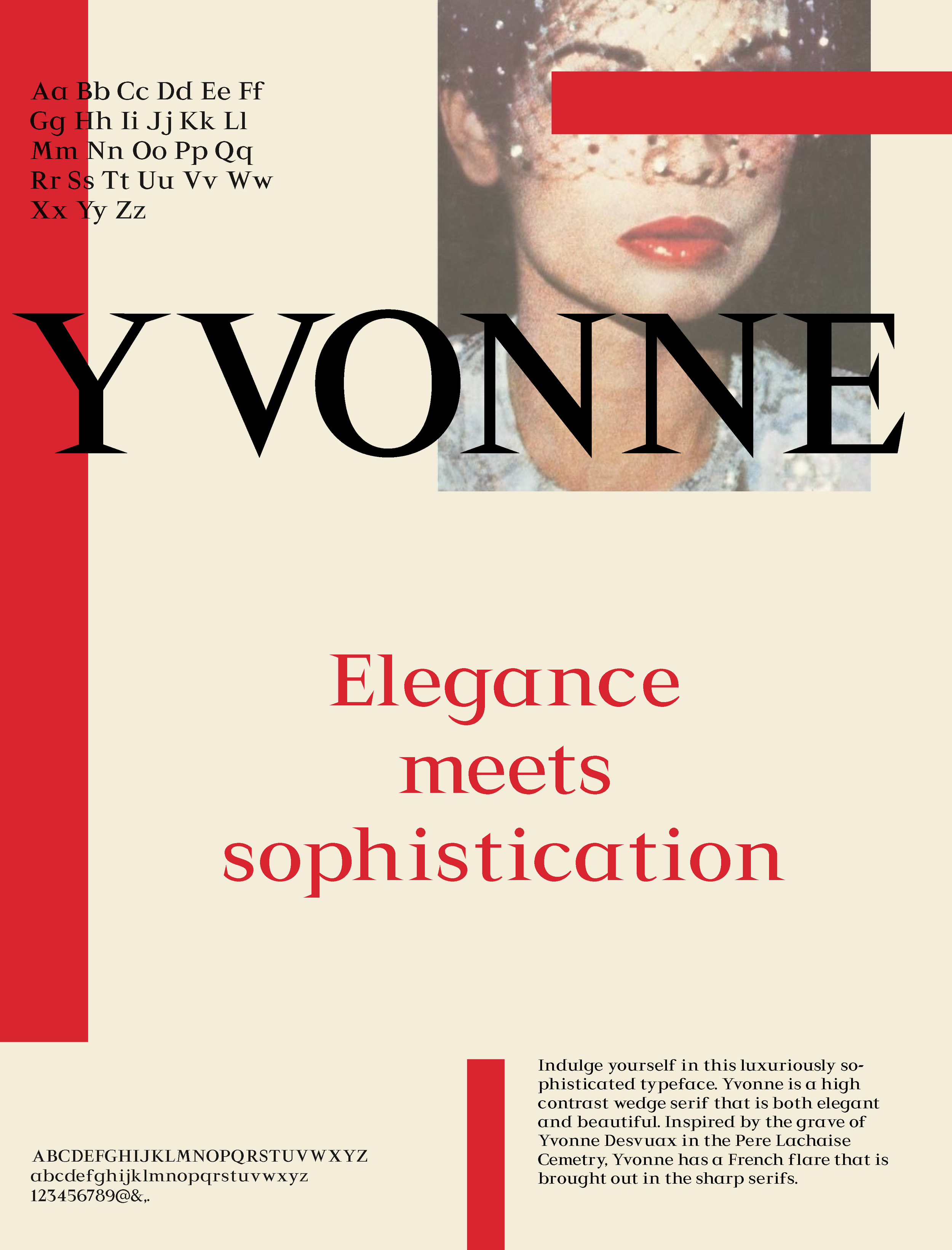
Below is our final poster that was created to showcase the personality and physical characteristics of our font.
Project Details
Duration: 5 weeks
Team: Justin Tran, Dan Neifert, Patricia Lee, Brennan Jackson
Role: Creation and design of 14 letter characters and symbols + poster design
Sketching Letterforms
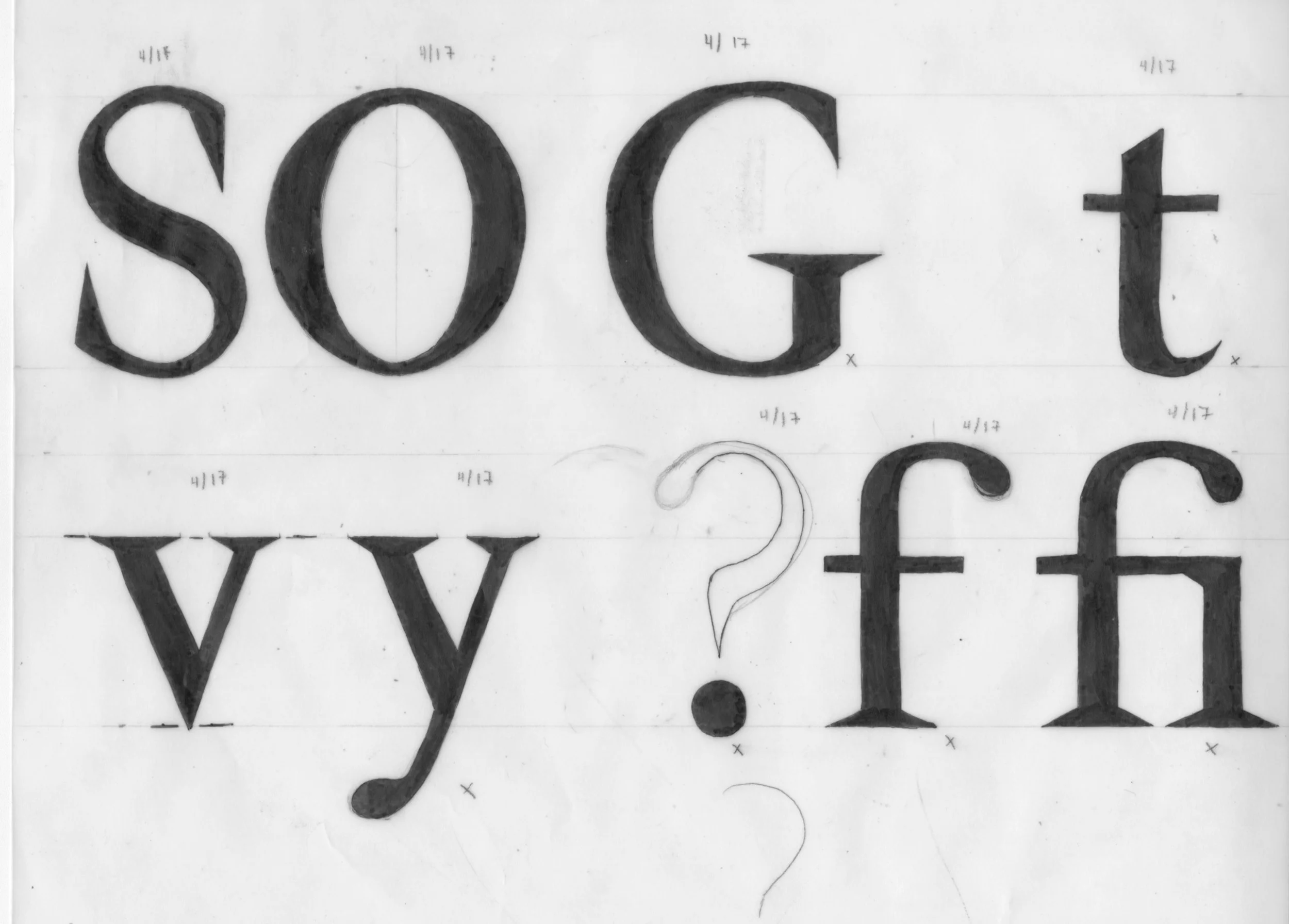
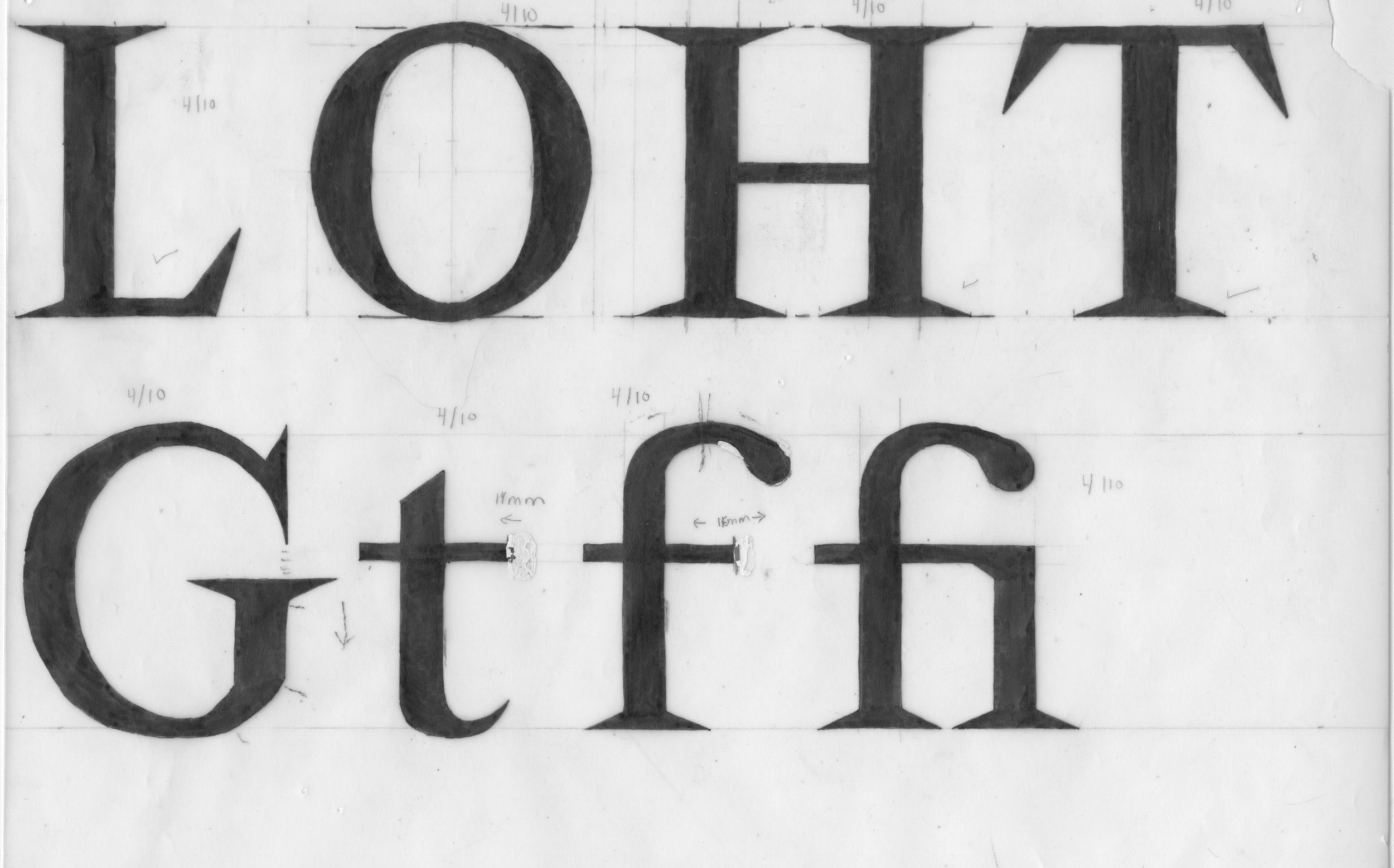
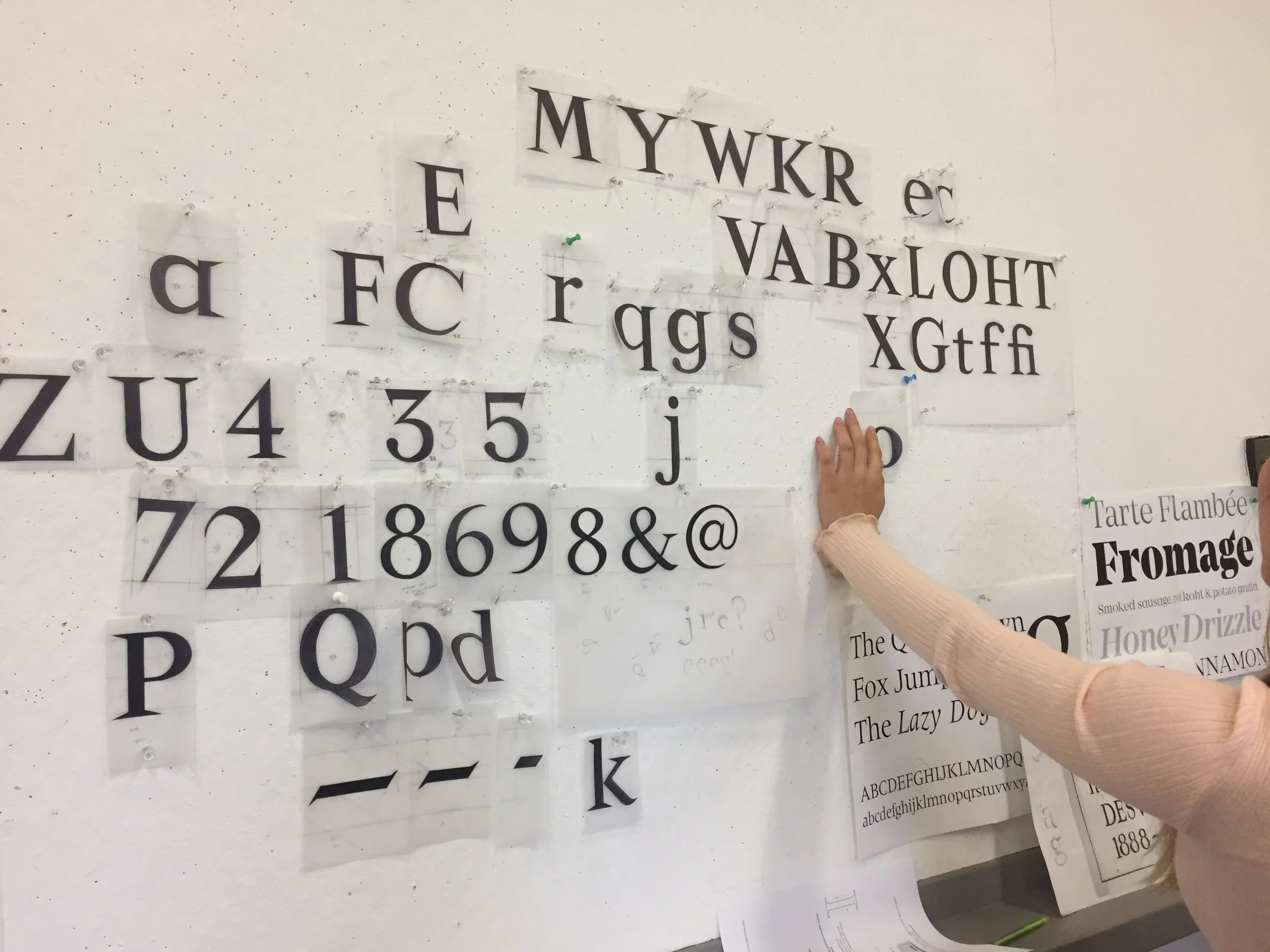
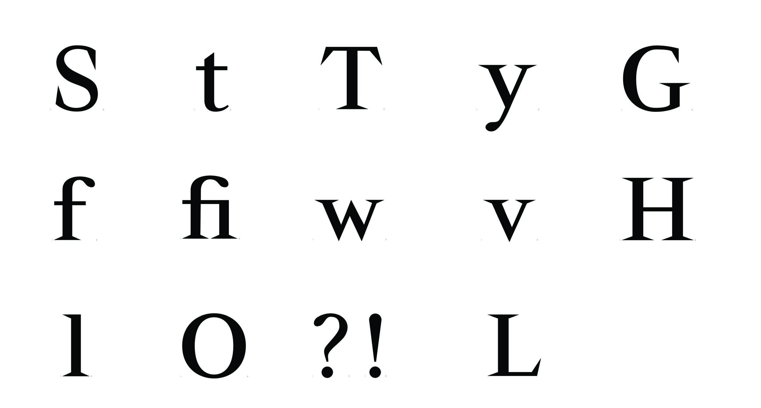
We started off by hand-drawing the letters on tracing paper, adhering to the measurements (of the thicks, thins, diagonals) we established. As a team, we distributed letters to work on and create. Below are my sketches of the 14 characters and symbols I was responsible for.
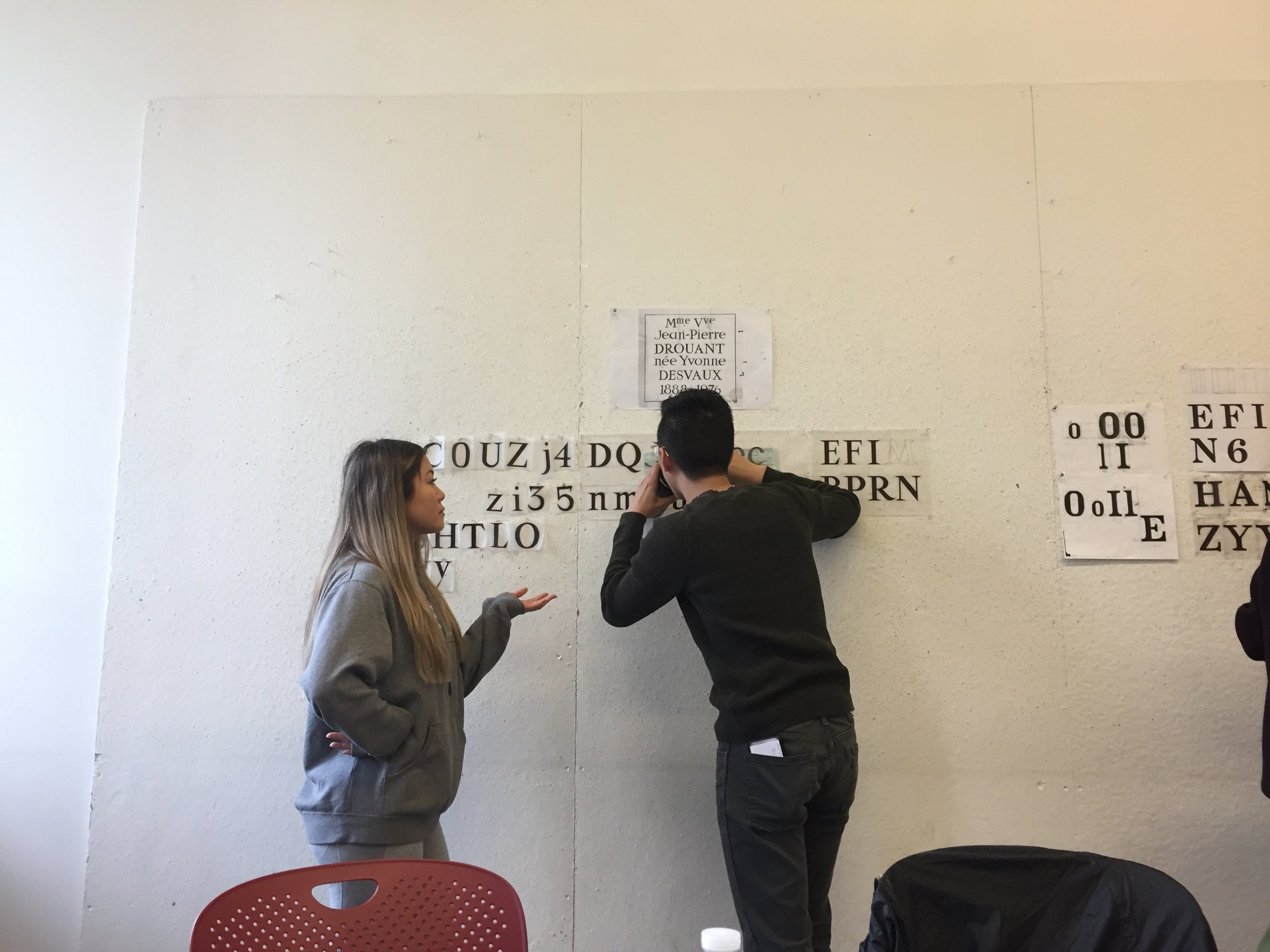
We met up weekly (or more) to critique each others letter forms and symbols. We went through about 5 rounds of iterations and sketching.
Digitalizing Letterforms
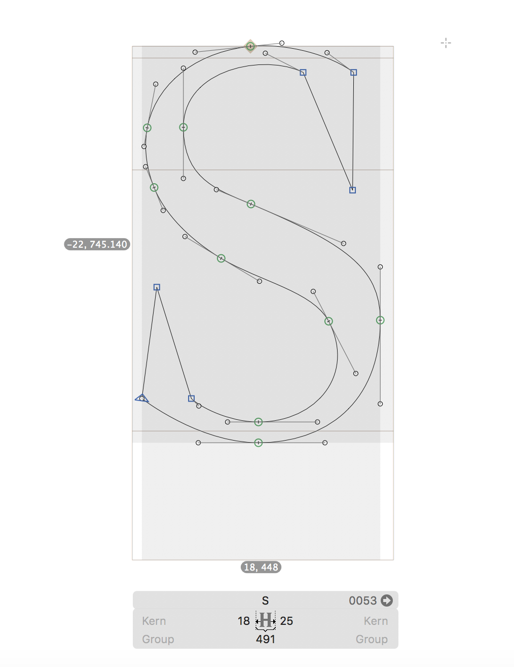
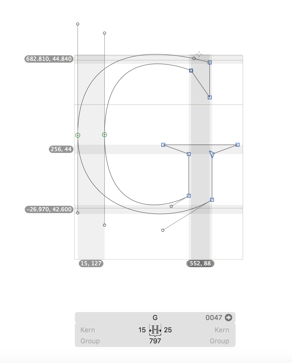
After a few rounds of sketching, we digitalized our letters on glyphs. This was an extensive process that took our team about 3 weeks to finalize.
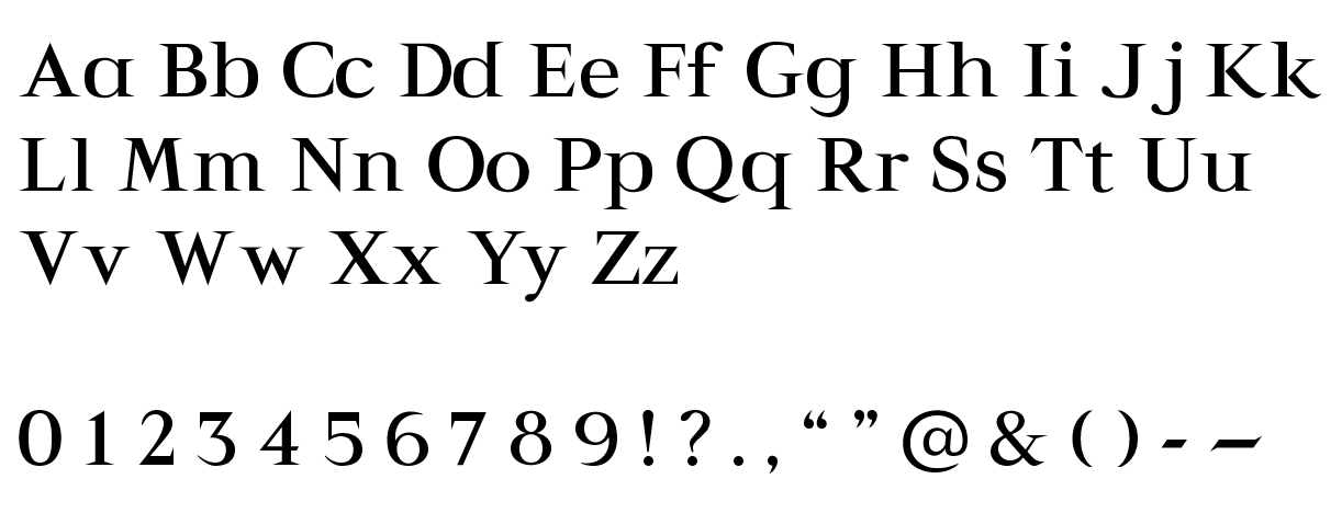
The image on the bottom left are my finalized characters and symbols. The image on the bottom right is the full finalized and digitalized alphabet + symbols for the Yvonne typeface.
Poster Iterations
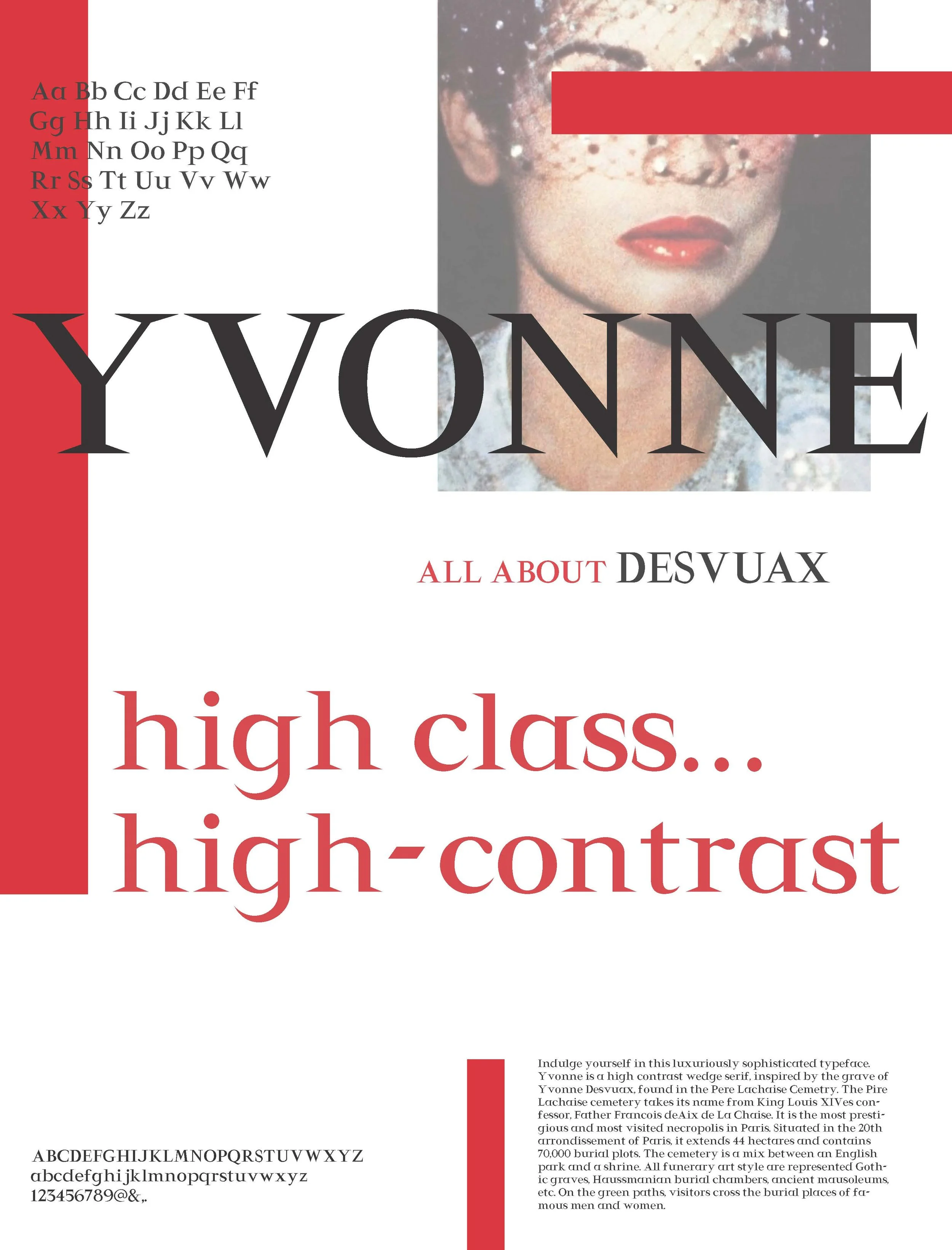
After finishing our letterforms, we started designing the poster. Below are a few poster iterations we underwent. Our previous iterations did not have the ligature for the “YV”, but we decided to create a ligature because there was too much tension between the wedge serifs. Although I did like the picture we previously used better than the one in our final, the quality of that picture did not print well.
Reflection
This project has given me a newfound respect for all of the type designers out there! Fine tuning and finalizing each letterform was extremely time consuming, but very rewarding. Overall, I’m really happy with the unique, wedge serif typeface we created.
Given if we had more time, I would:
Spend more time iterating/designing the poster. I feel like we could have pushed the overall composition more.
Refine my “?” letterform.
Create more characters (especially character accents).
